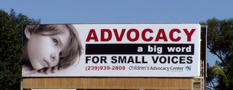
Top 3 tips to making OOH (aka Out-Of-Home) branded billboards stop them in their tracks, before racing by!
1. KISS Principle – Keep it Simple S—– – your entire message needs to be short enough to read or imply in 4-5 seconds or less. The road calls for many distractions select a single message, then keep it short and to the point.
2. FONTS Matter – The bolder the better. Use all caps sparingly on ONE or TWO easy to recognize words; sentences are easier to read in upper & lowercase.
3. COLOR Pops – The use of color CONTRAST and VALUE contrast tends to work best for immediate reads.
A side note when choosing TECH versus OLD SCHOOL
There are two top types of OOH: Digital (LED) and Traditional (Vinyl). If using large areas of white in the design, it’s best to choose traditional vinyl. White as a large area is not as effective on digital billboards. If you need to have multiple messages though out the day, week or month, it’s best to go digital.
Click the video link below presented by Lamar Advertising Company that shows quickly how Out of Home Advertising can be uniquely creative.


Recent Comments