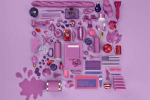
Pantone unveiled their habitual color of the year as coral, and we love it. More specifically, it is aptly named Living Coral, as a nod to its precious ocean-dwelling counterpart. Living Coral is fresh, subtle, yet energetic; characteristics you’d want in a leader. It is simultaneously bold and mellow – but how?
Its mellow, groovy undertones are reminiscent of the ’70s: an era where revolutions and free love were flooding the streets. Women were burning bras, moving up in business ranks, and looking good doing it. Women have made long strides in the past few decades with one common goal in mind: equality.
Living Coral’s boldness comes into play by teasing the traditionally conservative “pink” that has, for many years, been deemed as a woman’s color only. Nowadays, people are rejecting that way of thinking. More people are breaking gender barriers and embracing fluidity. Men are exhibiting their makeup skills, and women are rocking tuxedos without a stiff label attached to them. People are stepping outside of a cultural box to be uniquely themselves. This tangy take on pink is the obvious choice for Pantone’s color of the year for 2019.
Absher Design Group is all about staying fresh and exciting in an ever-changing digital world. That is why we have given our brand a makeover that celebrates diversity and strong, feminine attributes. We do not want to hide the fact that we are a female-dominated business – in fact, we want to embrace it. We have adopted Living Coral into our new color palette for our brand. Coral itself is resilient, supportive, and intricate. Absher Design’s incorporation of Living Coral into their brand identity represents coexistence and radiant energy. It is a fresh outlook on the road to equality.
Spirited, vibrant, and sweet, Living Coral paves the way for a brighter path.


Recent Comments